Chelmsford City Branding
In 2012 Chelmsford was granted city status. With the new change in status, the council wanted to revitalise their identity and build a stronger brand image. The brief was to create a brand identity and logo which felt dependable, represented key elements of Chelmsford (history, architecture, natural spaces) and would make them feel unique to other local authorities.
We delivered
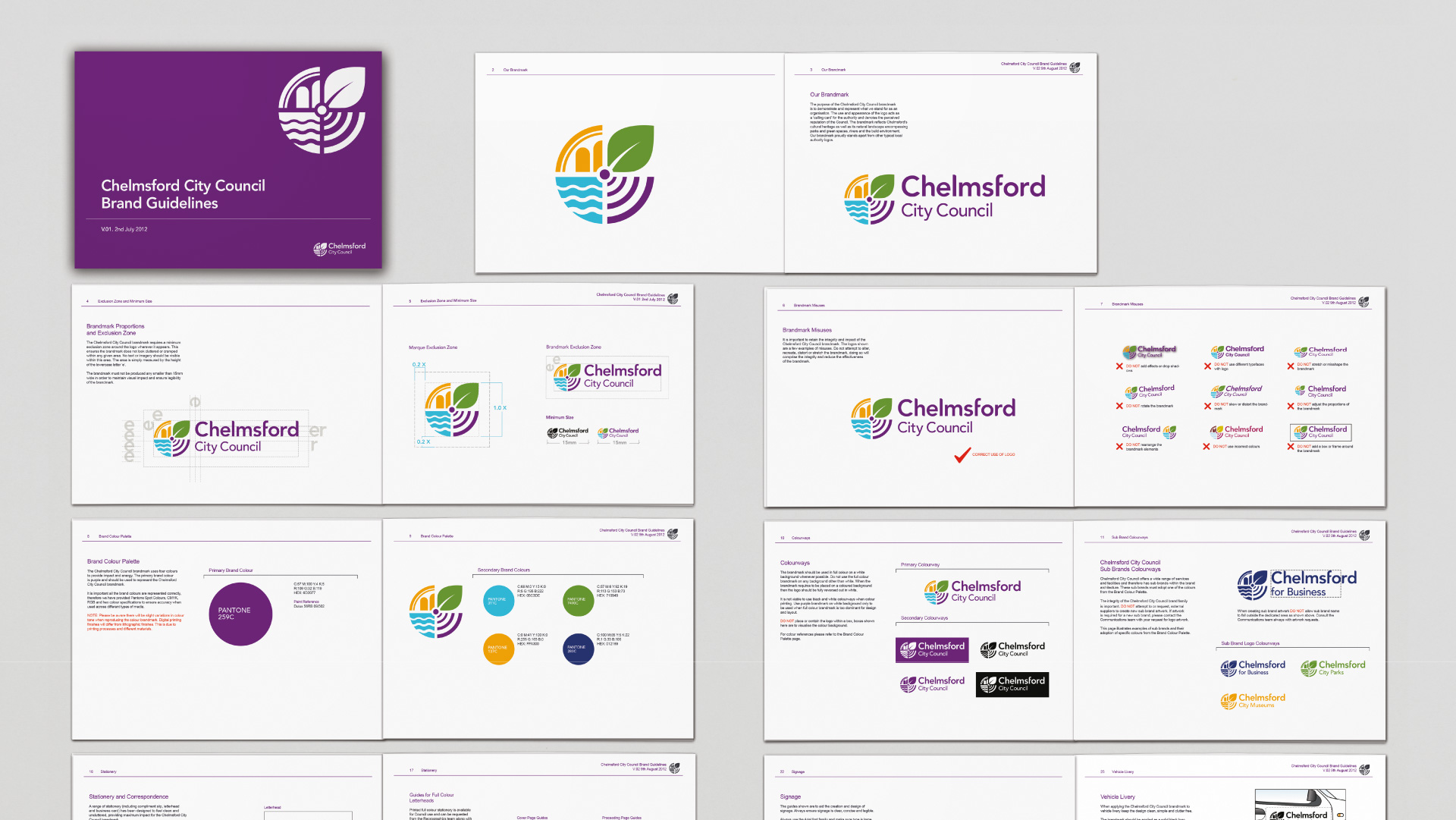
Branding. Brand Identity. Logo. Brand Guidelines
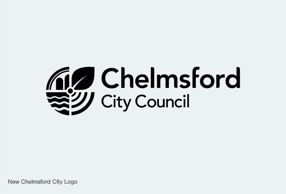
Chelmsford City Logo and Brand Identity
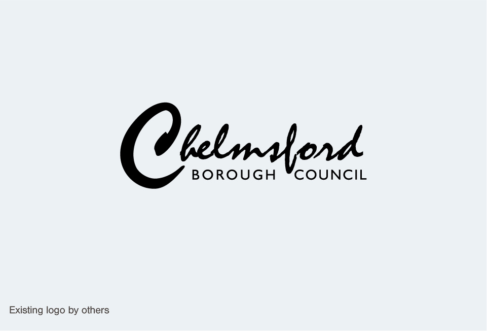
At the start of the project we began extensive research into council authority branding, immersing ourselves in Chelmsford’s history, future developments, local life and the council’s values and aspirations. A complete new direction for the identity was needed moving away from a script font for the logo which was difficult to read and not very identifiable, as well as looking towards a more colourful and uplifting colour palette. The final Chelmsford brand identity was bold and refreshing for a council authority. The logo managed to incorporate several key aspects of Chelmsford life (without being too busy) and was adaptable across many brand applications. The new identity has received positive feedback from the local community and aided the Council in the promotion of Chelmsford with it’s new city status.


