Hylands Estate Brand Identity
Hylands Estate is well known for its beautiful parklands and the famous events it hosts. Our brief was to create a brand identity which underpinned the commerciality of the house for hiring to business and public clients.
The brief was to establish an identity which would engage with two specific audiences, the corporate sector looking to hire a venue for events or meetings and the public clients, and even more specifically, wedding clients.
We delivered
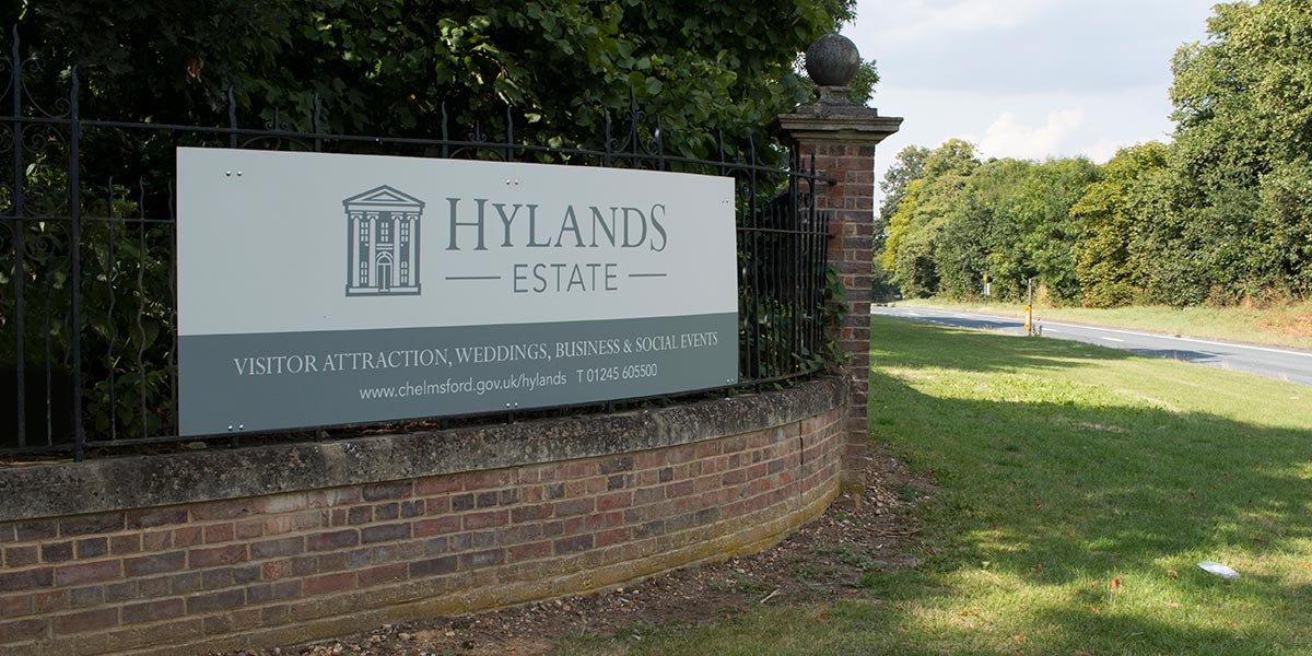
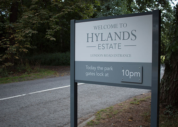
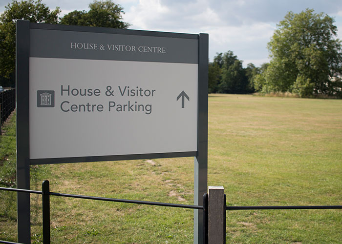
Brand identity. Graphic Design. Experinetial Design. Signage Design. Wayfinding. Website Design & Build. Brochure Design.
The Logo
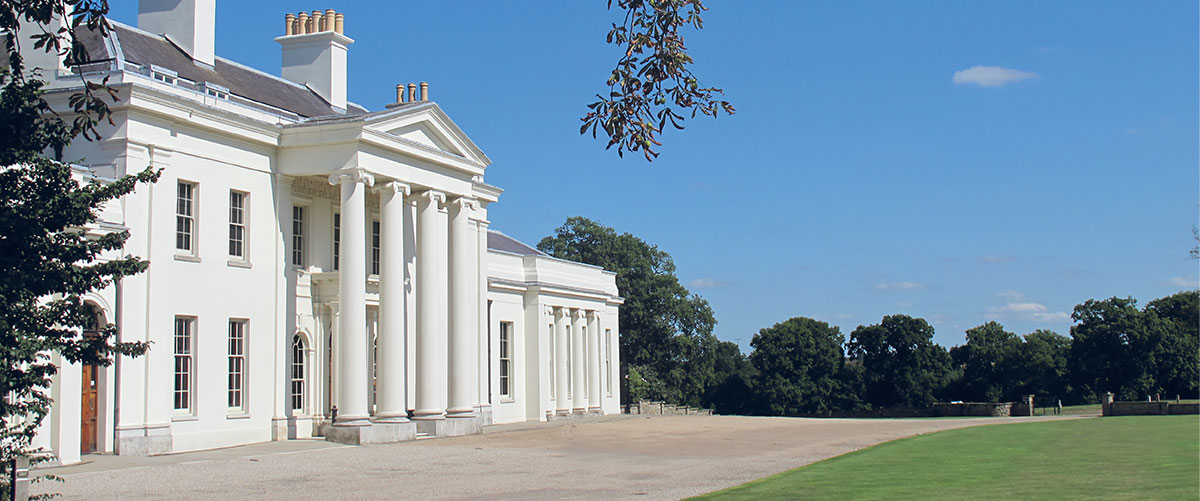
Hylands House & Estate had no previous cohesive identity or consistent brandmark used on brand communications. The new brand identity needed to feel timeless and not en vogue or trendy. The logo had to be easily identifiable as Hylands and echo the values of the welcoming and friendly nature of the staff. From the start of the research and concept stage it was obvious the most identifiable element of Hylands was its neoclassical nature and that would provide a great source of inspiration for the brand creation. The chosen solution for the logo was an iconic illustration of the house, timeless in it’s approach but strongly representable of the Hylands Estate brand.
The Identity & Marketing
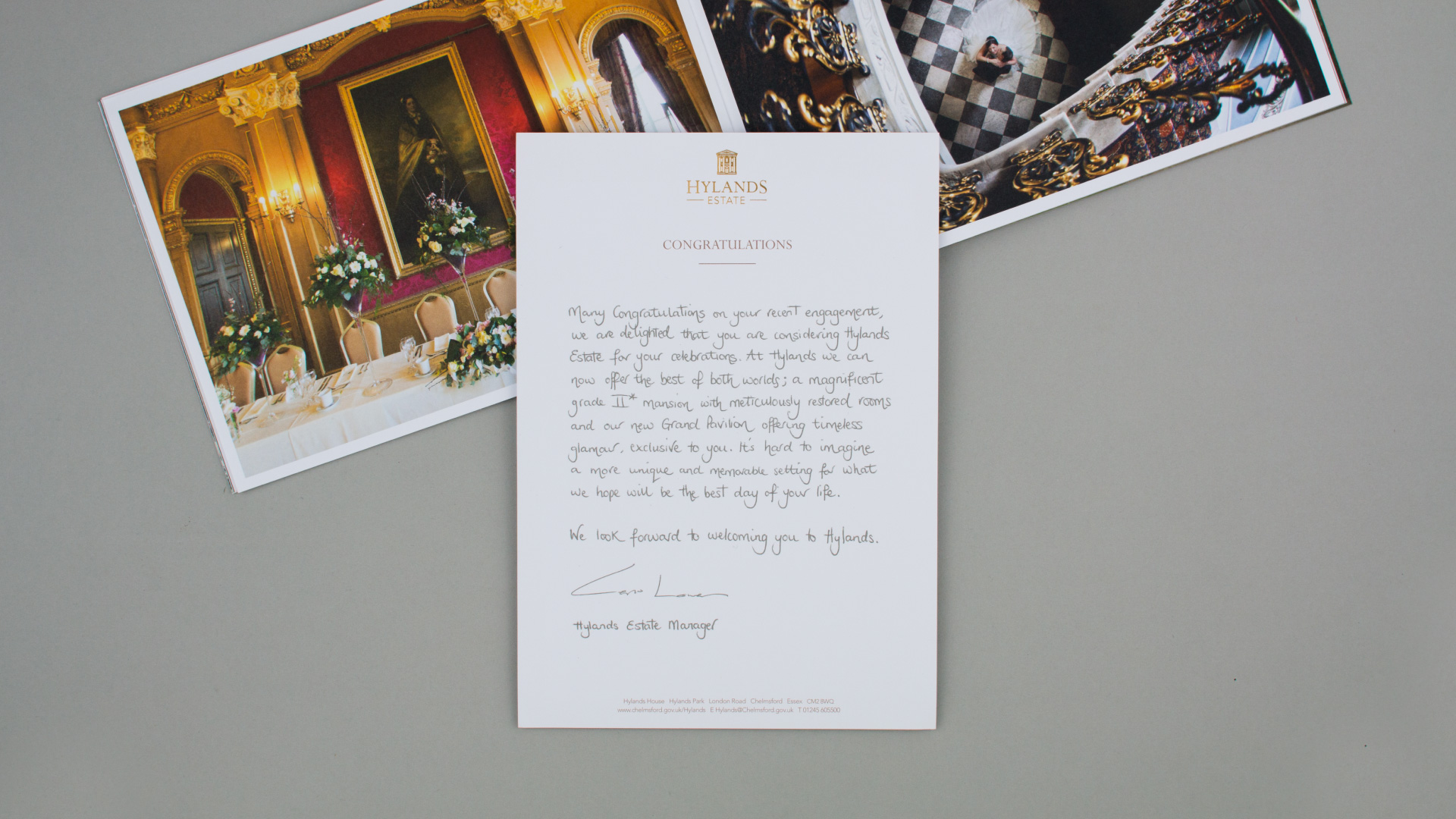
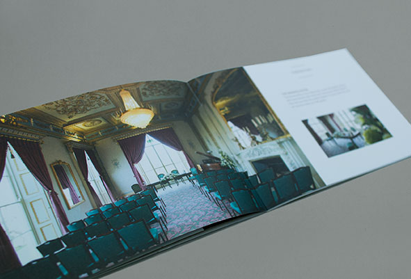
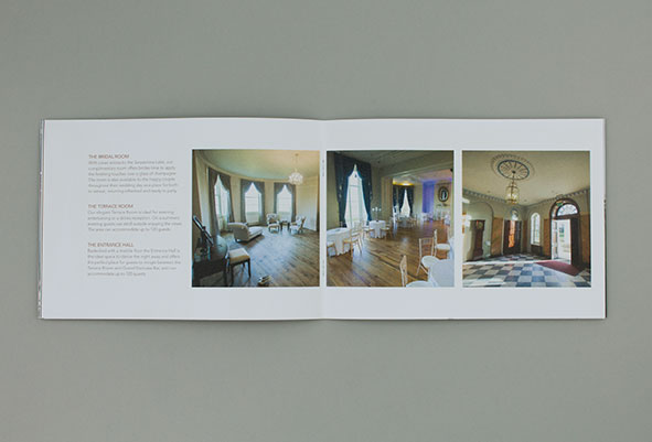
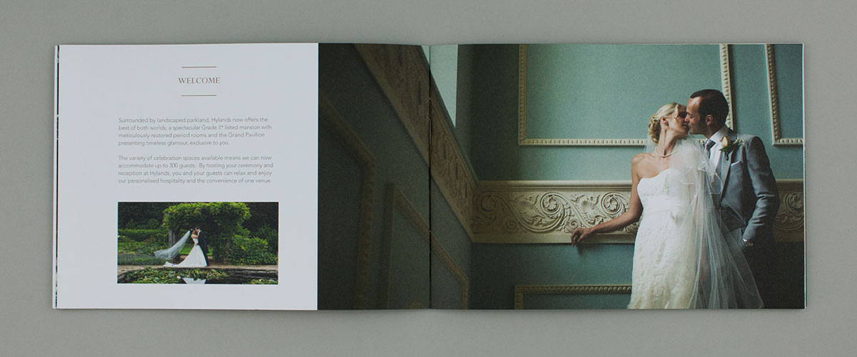
The look and feel to the identity and marketing was a clean, minimal approach and using a warm natural brand colour palette allowing the imagery of the stunning architecture to be the hero of brand communications. Two marketing brochures were developed to allow the marketing to be more relevant towards it’s target audience. The corporate brochure focused on providing key information and facts quickly alongside clean layouts of imagery and type to be visual motivating. The wedding brochure used a more charming feel utilising large landscape imagery to allow the audience to be drawn in and captivated by the interior architecture.
Hylands Estate Web Design
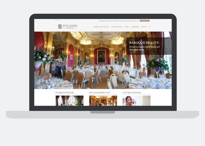
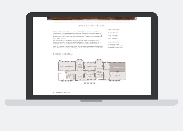
The website developed was purely targeted towards wedding clients allowing the design to charm visitors with large sliders of stunning imagery and focus on proving more revolt information and content to prospectus wedding clients. This allows for a more organic journey through the site or via the menu navigation. The website was a responsive build allowing visitors well on a variety of devices. The success of the project saw an increase of 3 times the amount of enquires within the first 2 months of launch.
